A design language to empower consistency and compliance.
The lack of standardization in visual design, navigation, and accessibility on the web platform. To fix this, we created a centralized design system to provide a consistent user experience across all pages. It serves as the basis for uniform user interface elements, visual styles, and accessibility features, ensuring smooth interaction for users.
Typography System
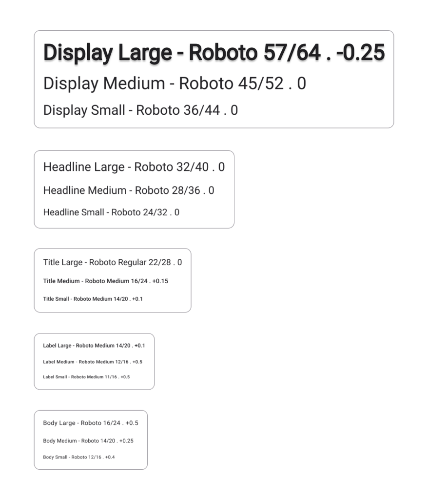
The design system emphasizes font selection that aligns with the brand personality while providing clear guidelines for hierarchy, weights, and sizes. This ensures readability and consistency across all pages, enhancing the overall user experience.
Typography
Visual Identity and Palette
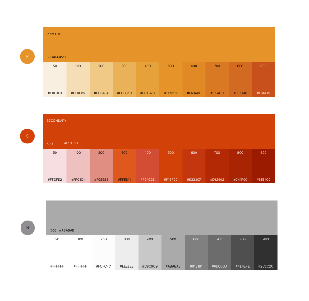
A carefully defined color palette aligns with the brand identity, incorporating primary, secondary, and neutral tones to maintain visual harmony. Accessibility is ensured through thoughtful contrast ratios, enabling inclusive design for all users.
Colors
UI Components
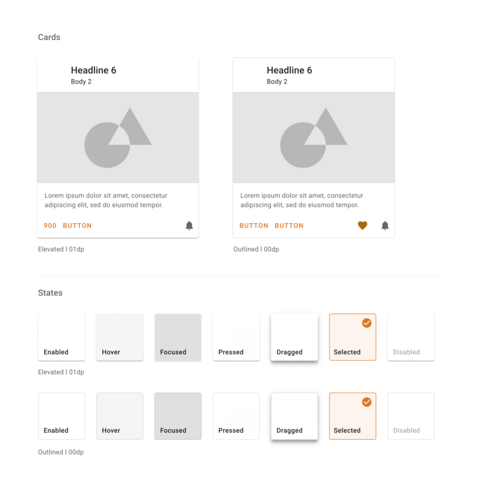
Cards serve as versatile containers, holding a variety of content such as images, headlines, supporting text, buttons, and lists, while dividers group content effectively within lists and layouts. Buttons are designed to encourage user actions like sending an email, sharing documents, or liking comments, ensuring clarity and intuitive use.
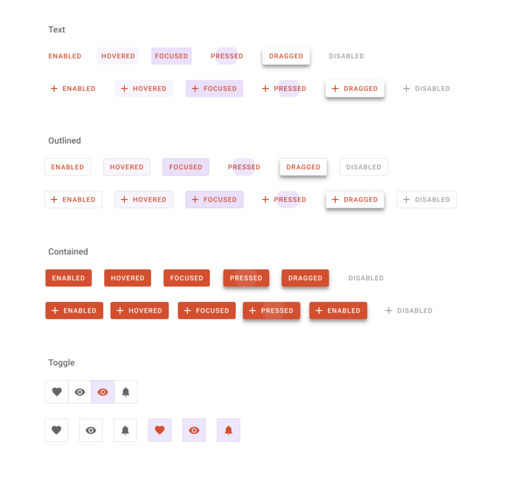
Buttons
Cards
The responsive design system optimizes layouts, while spacing guidelines maintain harmony and consistency across visual elements, ensuring a smooth and engaging user experience.