Therapists Patient Dashboard
Designed a comprehensive dashboard enabling pediatric orthopedic therapists to monitor patient adherence, visualize progress data, and communicate with families—all within a unified platform.
Challenge
Therapists treating children with complex orthopedic conditions faced:
- Scattered patient data across manual notes, emails, and verbal reports
- No real-time visibility into treatment adherence
- Time-consuming administrative tasks reducing clinical focus
- Inefficient parent communication across multiple channels
Research & Discovery
Target Users
Pediatric physical therapists treating children who use orthoses for conditions like cerebral palsy or scoliosis.
Problem Statement
Fragmented tracking systems and communication channels were leading to suboptimal patient adherence, prolonged treatment timelines, and potential therapist burnout.
Solutions
Information Architecture
User flows
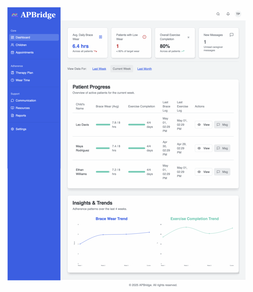
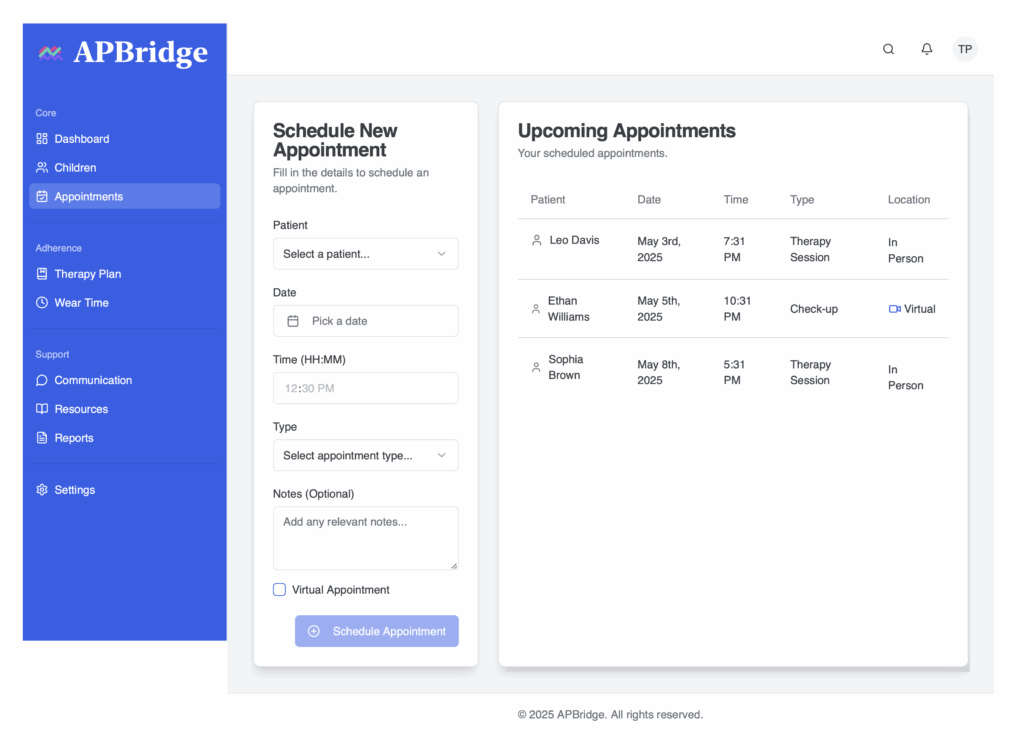
- Dashboard: Snapshot of all patients with quick-view adherence alerts.
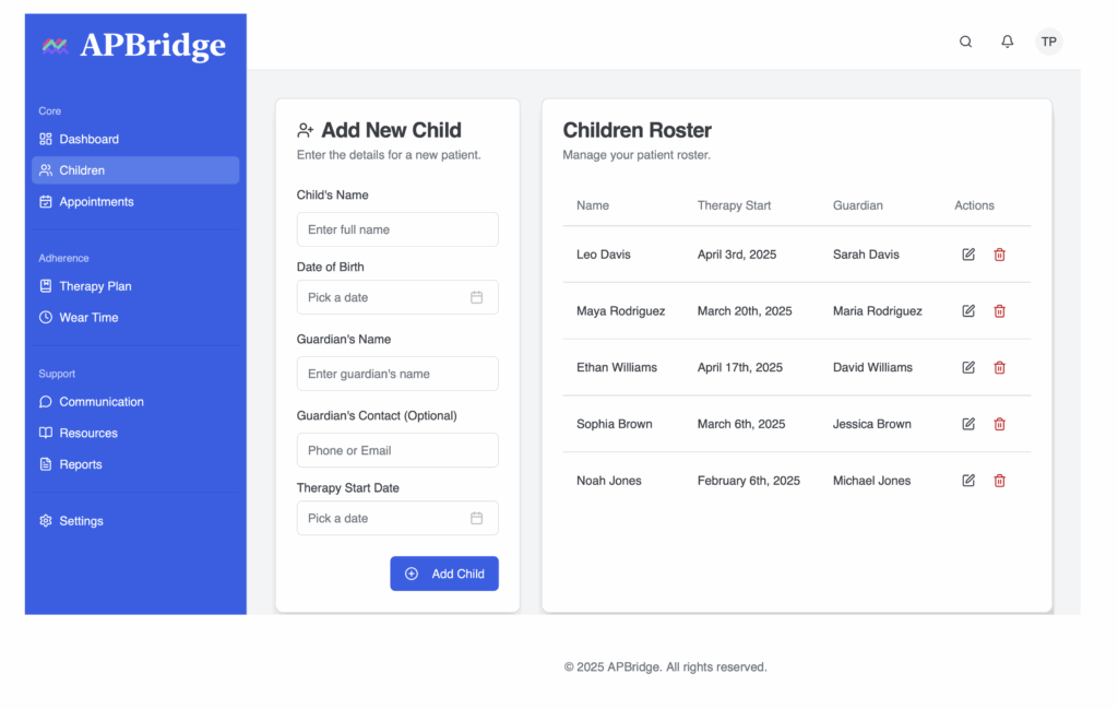
- Patient Summary: Demographics, current treatment plan, overall status
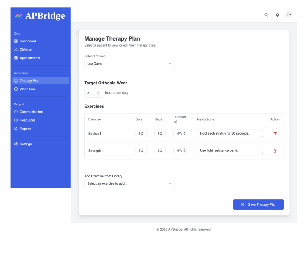
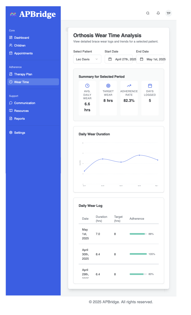
- Brace Wear Tracking: Visual logs ( interactive line graphs, daily logs) displaying historical and current brace usage data.
- Exercise Log: A clear log of prescribed exercises and patient-reported completion status.
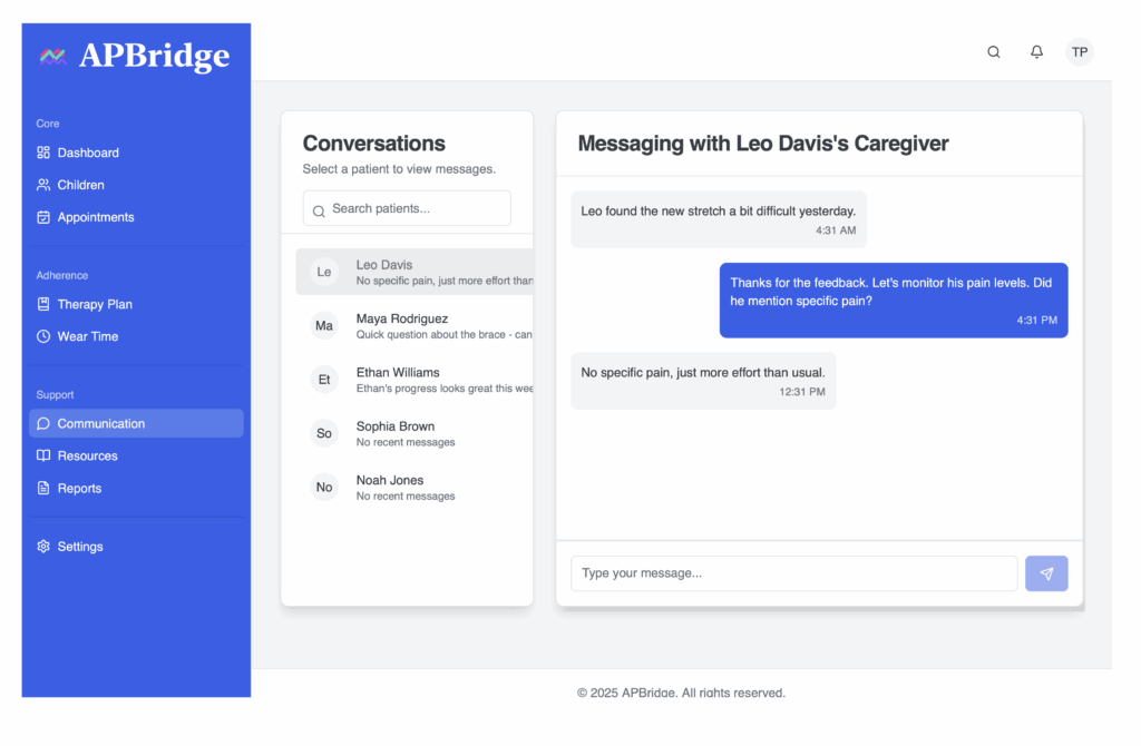
- Communication History: Secure message threads.
- Alerts & Notifications: Custom thresholds for intervention
- Quickly checking a patient’s current status from the main dashboard.
- Reviewing detailed historical brace wear or exercise data for a specific patient.
- Initiating and managing communication threads with parents.
- Setting and managing alert thresholds.
UX Design Principles
- At-a-Glance Information: Centralized access to patient metrics
- Streamlined Navigation: Ensuring quick and easy movement between different sections of the app.
- Actionable Insights: Easy-to-spot trends and flags.
- Contextual Tools: Providing relevant communication and management tools directly within the patient’s profile.
- Customized Views: Filter and prioritize by urgency or condition
UI Design Elements
The visual design focused on professionalism, clarity, and ease of use
- Clean and Organized Layout: Utilizing a grid system and ample white space to prevent information overload.
- Consistent Typography and Color Palette: Professional color palette distinguishing information hierarchy
- Effective Data Visualization: Purposeful data visualization matching chart types (line charts for trends, bar charts for comparisons) to data requirements
- Intuitive Iconography: Using universally recognizable icons to aid navigation and understanding of features.
- Responsive Design: Responsive design ensuring cross-device functionality
- Design system showcasing color palette, typography, and component library
Problem Solved
Centralized Dashboard: Therapists no longer juggle paper notes, emails, and memory. APBridge consolidates all patient data—brace wear, exercise logs, communication, and alerts—into a single, real-time interface
Proactive Alerts: By visualizing trends and setting alert thresholds, therapists can now identify non-adherence early and intervene before small issues escalate into major setbacks.
Streamlined Workflow: Manual documentation and back-and-forth communication with parents are significantly reduced. APBridge automates data collection and provides quick access to key insights, minimizing administrative burden.
Secure In-App Messaging: Scattered phone calls and emails are replaced with APBridge’s built-in messaging system, creating a traceable, secure communication channel that improves collaboration between therapists and parents.
Enhanced Efficiency and Focus: By minimizing non-clinical tasks, therapists can focus more on patient care and less on chasing information, leading to a more efficient and less stressful work environment.
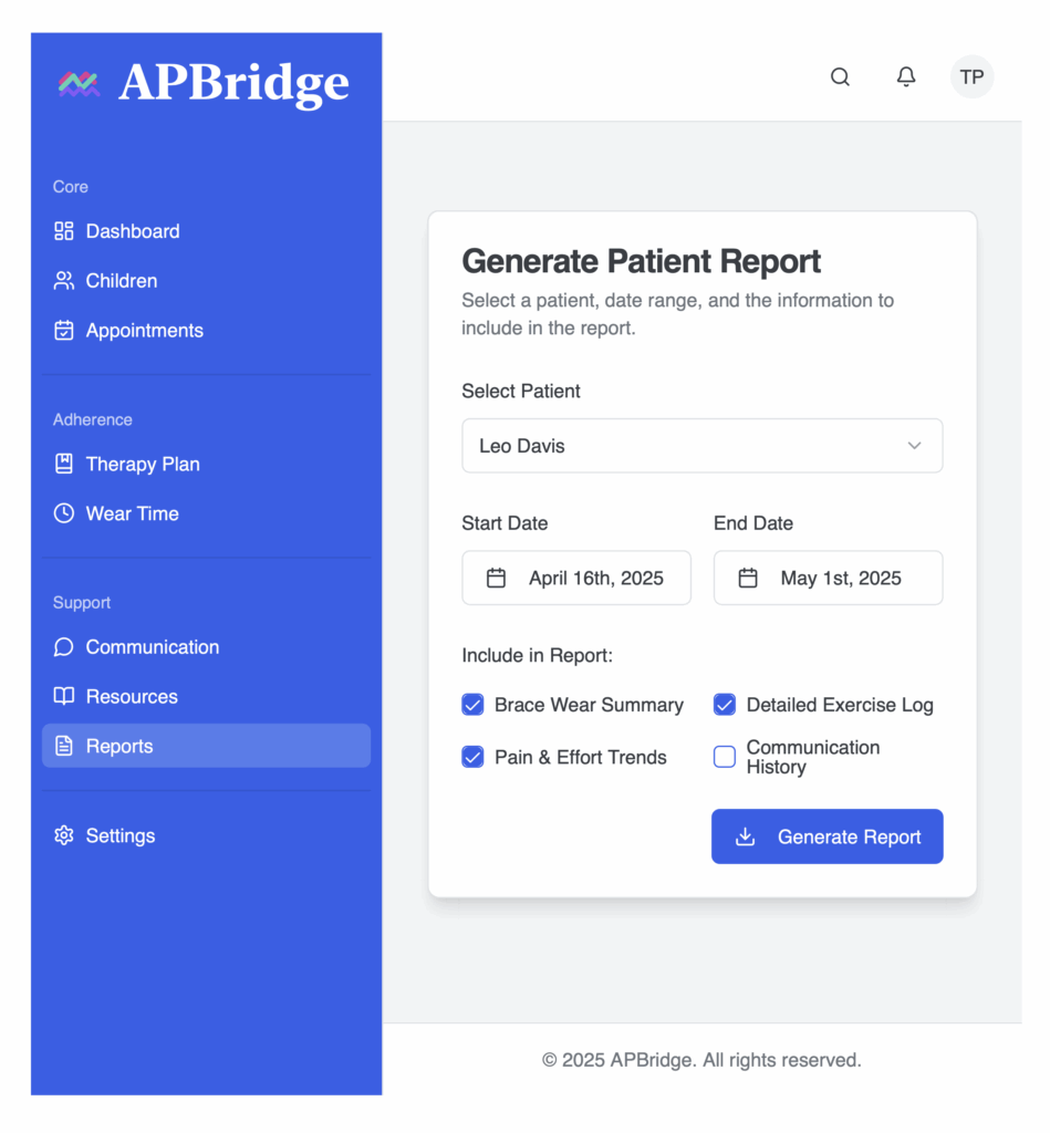
Clear Data Visualizations: Understanding patient adherence over time no longer requires manual effort. Therapists can now access interactive charts that make it easy to monitor trends and generate progress updates at a glance
Impact
The dashboard transformed therapist workflow by
- Consolidating fragmented data sources into a single, real-time interface.
- Enabling early intervention through trend visualization and alert systems.
- Reducing documentation time through automated data collection
- Creating a traceable communication record between therapists and families
- Allowing therapists to shift focus from administration to clinical decision-making
Tools & Methods
- User research: Contextual inquiry, stakeholder interviews
- UX design: User flows, wireframing, prototyping
- UI design: Design system development, responsive layouts
- Testing: Usability testing with therapists
Interactive Prototype : Access the clickable prototype demonstrating the complete user flow from dashboard overview to patient details.