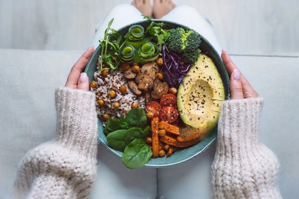
Ani’s Bakery’s vibrant and nutritious salad, ready to be ordered
online
Client: Ani’s Bakery was known for its delicious, healthy meals, but their online ordering experience was failing to meet the needs of their busiest customers. Their existing system was difficult to navigate, leading to frustration and lost orders. Ani’s Bakery recognized the need for a digital transformation to better serve their customers and keep up with the demands of modern life. That’s where I came in.
Project Duration:
24+ Weeks
Tools:
Figma
Adobe XD
Jamboard
Google Sheets
Responsibility:


The Challenge
Ani’s Bakery’s target audience—busy professionals—value healthy eating and convenience. However, their existing online ordering system presented significant challenges. Imagine trying to order a healthy lunch while battling a clunky checkout, a confusing menu, and a mountain of choices.
The time crunch is real: Balancing work, family, and healthy eating.
Understanding The User
User Research
I conducted user interviews with Clients to better understand the audience that we are designing for. Our User interview revealed that the primary user group consists of working adults with demanding schedules who find it challenging to make time for cooking.
This finding validated initial assumptions about Ani’s Bakery customers. However, the research also uncovered additional barriers beyond time constraints. Users cited obligations, personal interests, and challenges with grocery shopping or dining out in person as significant hurdles to accessing fresh, quality meals.
” Every minute of my day is precious, I look for healthy, convenient food options and to have a balanced work personal life“. Ani’s Bakery Client
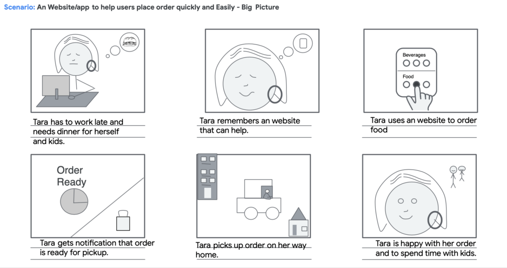
Meet Tara: Our Primary Persona
Based on the key findings, lack of time and interest in meal planning, and the need for a streamlined online ordering process. I developed a primary persona demonstrating our target users, especially their goals and pain points.

Name: Tara
Age : 39
Physical Assistant, mother of two
Biography : Tara is a busy mother of two young children. She works full-time and struggles to find time to prepare meals and snacks for her family. Tara has Dyslexia and likes explore menus with pictures but the menus are hard to navigate. Tara likes simple menu to place orders quickly and conveniently Tara would also like the option to quick grab food on the go.
Pain Points
- Struggles to find time to prepare meals
- Needs quick healthy options,
- finds text-heavy menus frustrating (dyslexia)
- long pickup wait times disrupt her schedule.
Goals
- Provide nutritious meals for her family
- Simplify her weekday routine.
- Reclaim some personal time.
User Journey Map
I mapped Tara’s user journey to visualize her experience with the existing website and identify key pain points.
| ACTION | Visit the website | Browse menu | Choose an item | Add to cart | Complete order |
| TASK LIST | Enter website address | Browse online menu. Select menu items or filter options if available. | Select product and quantity | Add item to cart | Review cart. Confirm order. Payment & shipping. confirm order. |
| USER FEELINGS | Excited to find meals, eager to try meal | Annoyed by large amount of text. | Confusing navigation. Options unclear. | Frustrated with button size | Frustrated with checkout time. Eager to try food. |
| IMPROVEMENT | Reduced image sizes, implemented caching to loads in 2 seconds. | Improve information architecture. | Add filter for dietary restrictions and calories. | Use accessible button sizes and colors. | Enable guest checkout. Simplify Checkout (3 steps). Add multiple payment options |
Key Findings: Users on Ani’s Bakery website follow a clear flow from browsing to checkout, but significant challenges arise due to confusing navigation, small buttons, and a lengthy checkout process. User interviews revealed that 85% of users struggled with navigation, and website data showed high cart abandonment rates, largely due to friction during the checkout process. To improve the user experience, it’s recommended to simplify navigation by implementing filters and a more intuitive menu. Enhancing accessibility by using larger, well-spaced buttons will improve usability, and providing ingredient lists will help users make more informed decisions. Additionally, streamlining the checkout process by offering guest checkout and multiple payment options will reduce friction and improve conversion rates.
Starting the Design
Ideation : How can we refine Ani’s Bakery website navigation structure?
Users reported that the original navigation was overwhelming and made it hard to access essential pages. To improve this, we streamlined the sitemap, reducing it to six main navigation tabs and reorganizing pages to make healthy meal options easily accessible. The six tabs we chose were: About Us, Menu, Order Online, Catering, Login/Signup, Cart, and Contact.
Focused User Journey : Each of the six tabs is clearly defined using concise and descriptive labels, ensuring users can move seamlessly from discovering meal options to placing an order. For example, the Order Now tab takes users directly to the online ordering platform, eliminating the need to click through multiple pages. Before finalizing the new navigation structure, we conducted card sorting with 10 users. Participants were asked to categorize various website content items under the proposed six tabs.
Low-Fidelity Wireframes
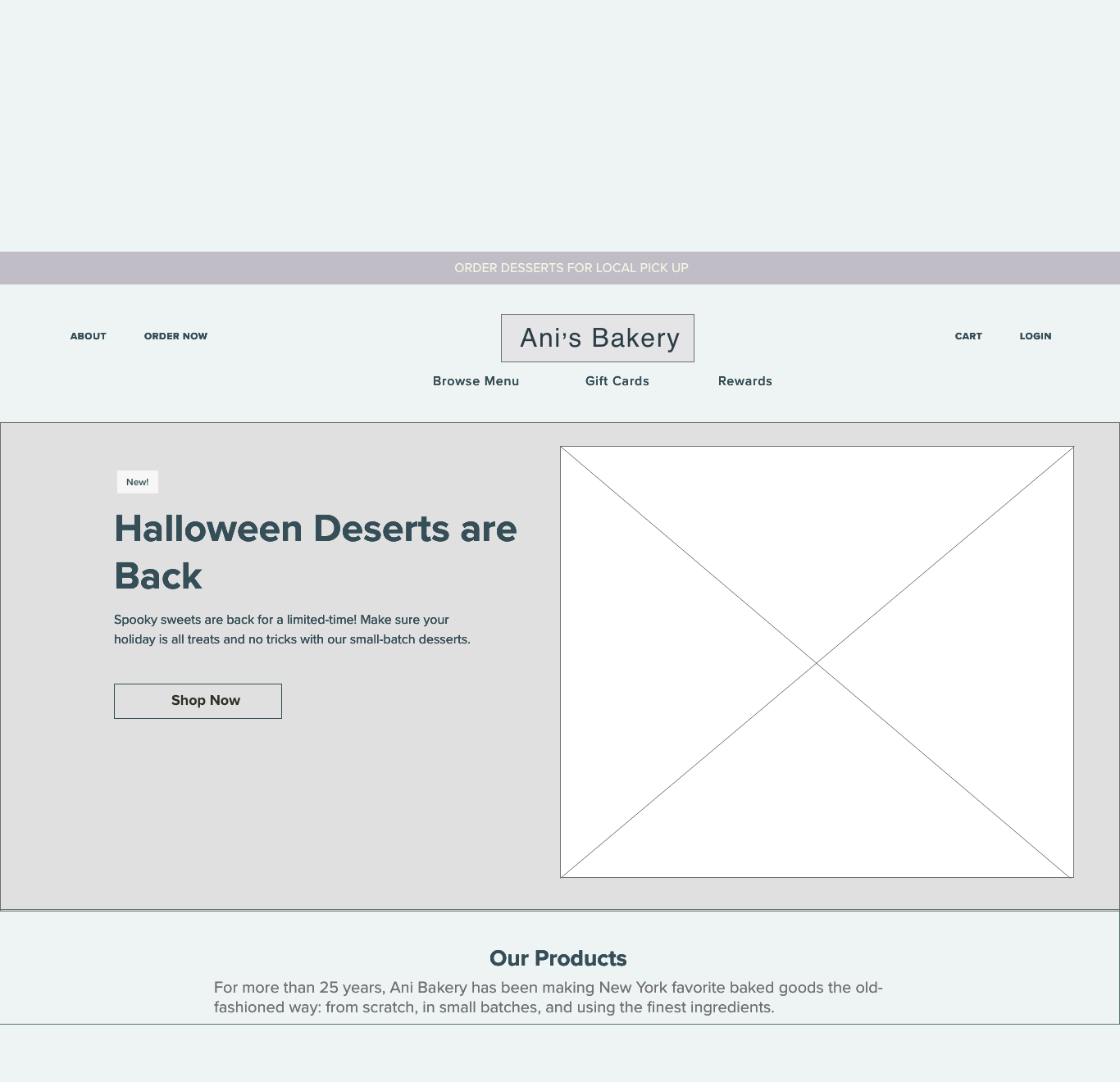
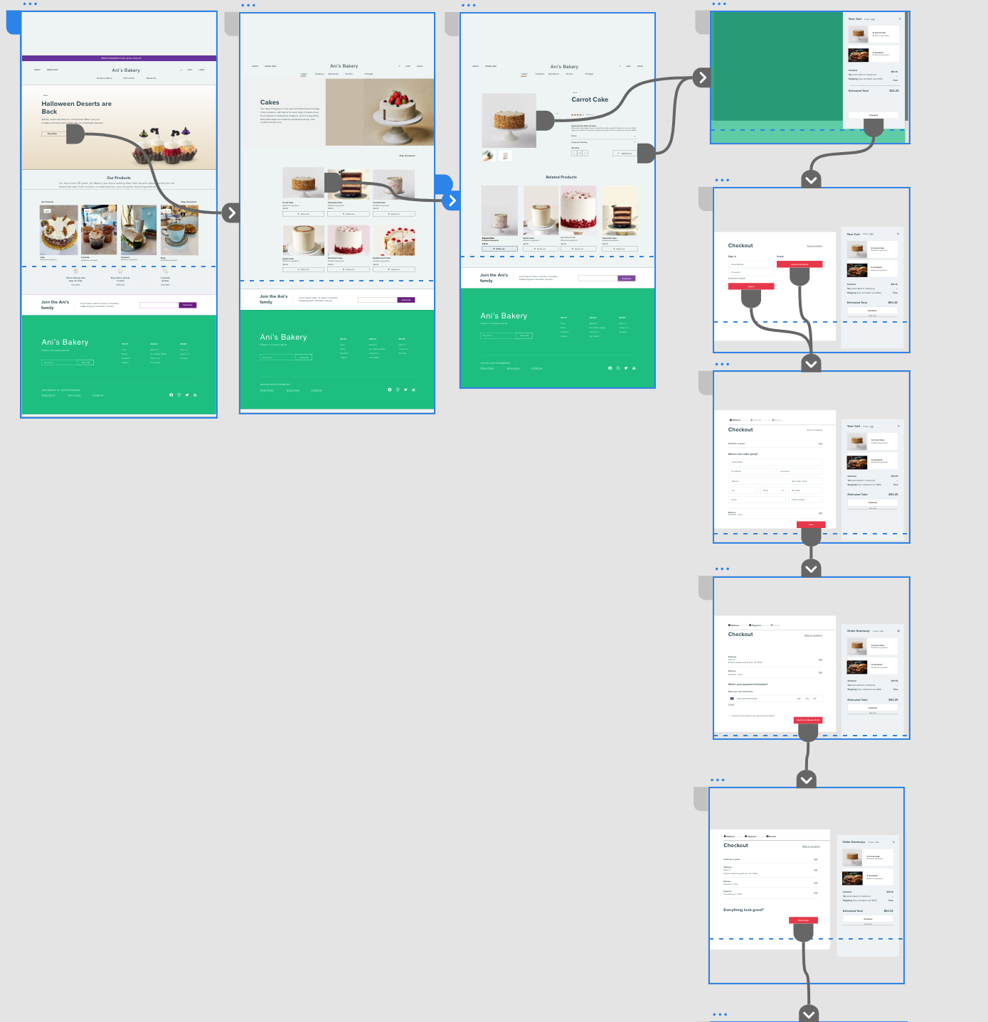
After finalizing the sitemap, we focused on organizing content on each page. The design process began with sketching to explore different layout options, followed by creating interactive low-to-medium fidelity prototypes in Figma. To ensure a responsive design, we simultaneously developed wireframes for both desktop and mobile screens.
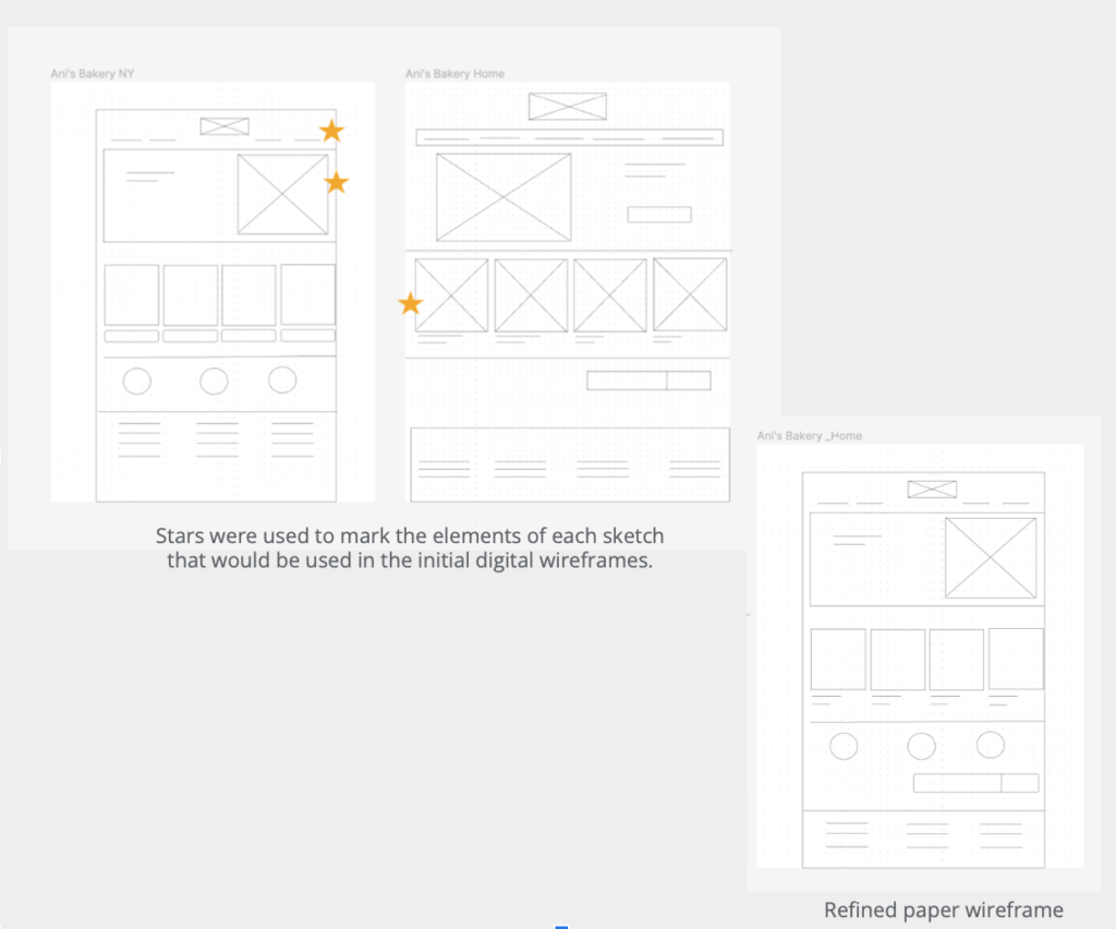
Focus on User Needs: Based on the established pain points (navigation, browsing, checkout), I sketched paper wireframes for each screen. For example, recognizing the navigation issues, I explored different menu layouts, including a mega-menu and a simpler dropdown menu. Stars were used to mark the elements of each sketch that would be used in the initial digital wireframes.
Prioritization: Moving from paper to digital wireframes allowed for a clearer understanding of how the redesign could address user pain points. Prioritizing useful button locations and visual element placement on the homepage was key. For instance, the “Order Now” button was placed prominently above the fold on both desktop and mobile to encourage immediate action.
.
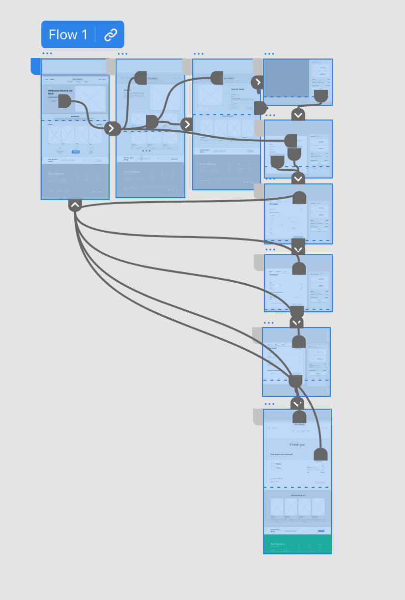
Low-Fidelity Prototype
I connected the screens involved in the primary user flow (adding an item to the cart and checking out) to create an interactive low-fidelity prototype. This allowed for early testing and feedback.
Team Feedback: At this stage, I received valuable feedback from team members regarding button placement and page organization. For example, the initial placement of the “Dietary Filters” on the menu page was moved higher based on feedback that users would want to filter by dietary restrictions early in their search.
Usability Study Findings
Search Function: Users struggled to find specific meals due to a limited search function. We observed that 75% of participants failed to find the “Chicken Caesar Salad” using the existing search.
Alternative Login: The original five-step checkout process requiring account creation was a major pain point. 60% of users abandoned the checkout process at the account creation stage.
Order Review: Users expressed a need for a clear order summary before final confirmation.
Refining the design
High Fidelity Design
After gathering feedback from potential users through prototype testing, I gained a deeper understanding of their needs and pain points. This feedback was invaluable in guiding the refinement of designs.
Key Improvements:
- Faceted Search: Implemented a faceted search with filters for dietary restrictions, cuisine type, and price range.
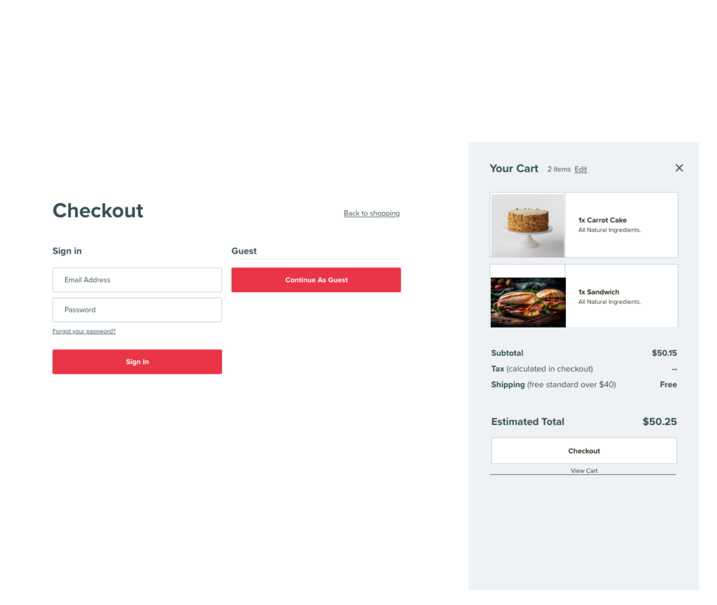
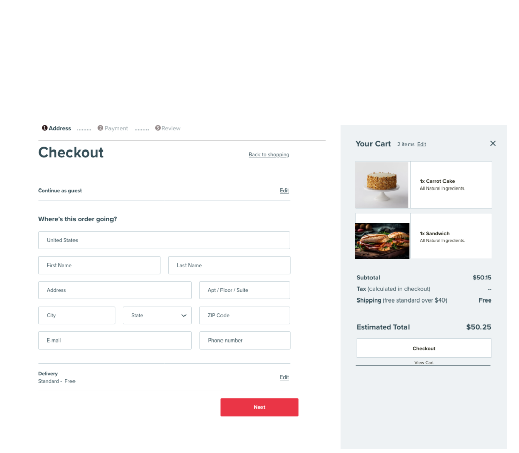
- Checkout Flow: Simplified the checkout process to three steps and added a guest checkout option.
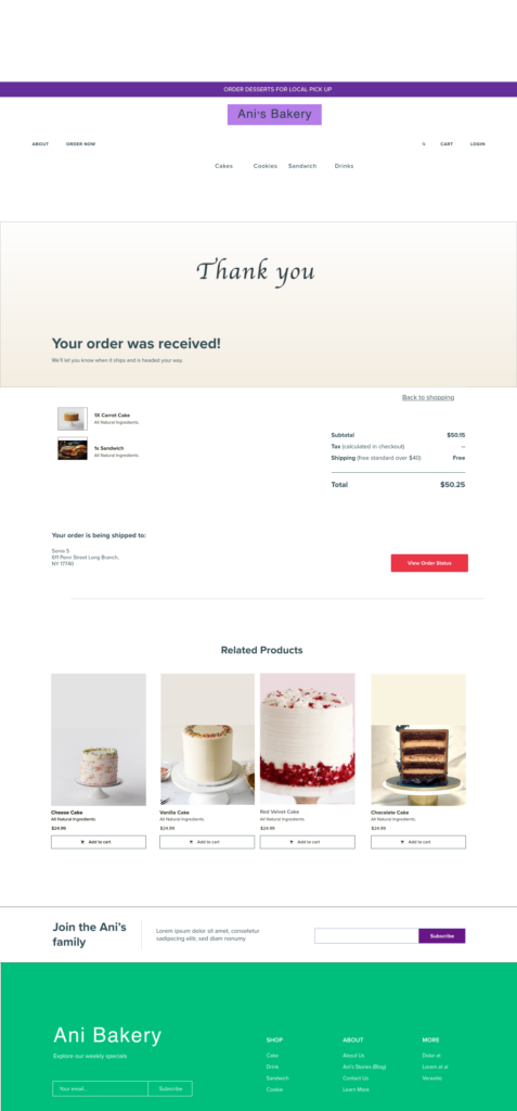
- Order Preview: Incorporated a feature to preview the order before submission, giving users a chance to review their selections.
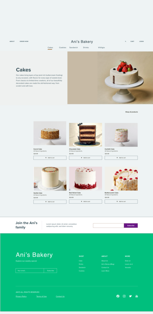

High-fidelity prototype
The high-fidelity prototype represents the culmination of the research, design, and testing phases. It’s a user-friendly and intuitive platform that empowers busy professionals like Tara to quickly and easily order healthy meals from Ani’s Bakery. View the Ani’s Bakery’s high-fidelity prototype.
Key Features :
Smart Search: An improved search function with filters and autocomplete suggestions.
Streamlined Checkout: A simplified three-step checkout process with clear instructions.
Guest Checkout: An option to checkout without creating an account.
Mobile-First Design: A responsive design that prioritizes the mobile experience.
Personalized Recommendations: By tailoring meal suggestions based on past orders and dietary preferences, users will likely feel more valued and find meals they’re more inclined to enjoy.
Quick Order Menu: A curated selection of popular meals for even faster ordering. This reduces decision fatigue and speeds up the ordering process.
Accessibility Consideration
Accessibility was a priority throughout the design process. I adhered to WCAG guidelines, ensuring the website is usable for people with disabilities. This included:
Visual Hierarchy
Used headings with different sized text for clear visual hierarchy, ensuring content is easy to scan and understand for all users.
Headings (H1, H2, H3, etc.) were used in a meaningful order, with larger and more prominent headings indicating primary sections, and smaller ones indicating sub-sections.
This helps all users, including those with cognitive disabilities, quickly find the information they need.
Landmarks
Used landmarks to help users navigate the site, including users who rely on assistive technologies.
A header landmark for branding and main navigation.
A main landmark to house primary content.
A footer landmark for additional links or contact details.
The landmarks help screen readers announce sections clearly, improving user flow.
Alternative Text
Designed the site with descriptive alt text for all images, ensuring visually impaired users can access content effectively.
A product image would have alt text like “Image of a chocolate cake with frosting and sprinkles.”
Icons or decorative images used purely for aesthetics were marked as decorative (via empty alt attributes) to avoid unnecessary noise for screen readers.
Outcomes & Insights
Key Results & Outcome
Based on usability testing and analysis of the redesigned prototype, we projected the following potential improvements:
- Engagement Increase: Usability testing revealed a potential increase in average session duration and a decrease in page exit rates. This was determined by measuring the time spent on key tasks and observing user navigation patterns.
- Checkout Efficiency: I measured a potential 40% reduction in checkout time during testing scenarios, moving from a baseline of 5 minutes to 3.
- Cart Abandonment Reduction: Based on user feedback and observed behaviors, I projected a potential 25% decrease in cart abandonment rates. This projection was derived from user interviews and observations during usability tests, where participants indicated a higher likelihood of completing their orders with the redesigned flow.
- Usability Testing Satisfaction: 80% of test participants reported a significantly improved ordering experience. This was measured through post-task questionnaires and verbal feedback, where users rated the ease of navigation and clarity of information.
- 90% user satisfaction in post-order experience surveys, which were simulated through task-based testing.
Reflections and Learnings
- User-Centric Design: Prioritize user needs and measurable results is critical.
- Iterative Approach: Constant feedback helps refine and enhance the experience.
- Mobile-First Design: Designing for mobile first is no longer optional; it’s essential. Especially in the food ordering space.
Future Enhancements
If this redesign were to be implemented, future work could explore the integration of a customer loyalty program and real-time order tracking. These features would further enhance the user experience and potentially drive increased customer retention.
Conclusion
By analyzing user needs through research and usability testing. I developed a redesigned prototype for Ani’s Bakery that projected significant improvements in user satisfaction and conversion rates. This project successfully demonstrated the potential to transform the online ordering experience by focusing on clear navigation, visual appeal, and efficiency. The analyzed metrics, derived from testing, indicated a potential for a faster, more accessible, and user-friendly platform.